Why most tonal outfits fail on real men
Most men try tonal dressing once, then never again. They pull on a beige shirt, beige chinos and beige sneakers, and the whole outfit melts into one flat block of color that kills any sense of shape. When every piece has the same light value, your body becomes a blob instead of a men’s outfit with structure and intention.
The real problem is not tonal dressing itself, but how men ignore value contrast, texture and clothing color when they build outfits. Value means how light or dark a color appears, so a navy jacket, a mid blue shirt and ink trousers can all be blue yet still read as three distinct pieces. In color science, this is called luminance contrast, and research from vision labs at MIT and the University of Washington shows that our eyes use these light–dark differences to separate shapes. When you understand this part of color theory for men’s outfits, you can wear colors, stay mostly neutral and still look sharp in both casual and smart casual settings.
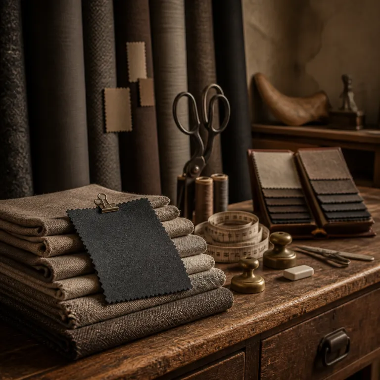
Texture is the second lever that separates strong outfits from lifeless combinations. A smooth poplin shirt, a slubby green linen overshirt and a dense twill chino in black or deep navy will catch light differently, even if the colors sit close together on the color wheel. That mix of textures creates depth, so your wardrobe feels intentional rather than like a pile of similar clothing in slightly different colors.
Think of bad tonal looks you see in men’s fashion on the commute. Usually it is one color combination repeated head to toe, with no shift in fabric, no contrast between light and dark, and no accent beyond maybe a white sneaker. Strong color matching keeps the palette tight but plays with neutral colors, secondary colors and subtle color combinations so the eye can travel from shirt to trouser to shoe without getting bored.

Using the color wheel without dressing like a rainbow
Color theory sounds academic, but the color wheel becomes practical once you simplify it. Instead of chasing every bright red or blue green trend, you focus on a restrained color palette built from navy (#14213D), charcoal (#333333), forest green (#1F3A2E), black (#000000) and off white (#F5F5F0), then add one accent at a time. This lets men build outfits that feel rich in color combinations without ever looking like a festival costume.
On the color wheel, analogous colors sit next to each other, like blue and blue green or forest and olive green, and they create calm color combinations that work well for men’s outfit ideas. Complementary colors sit opposite, like blue and orange or green and red, and they give you punchy color combinations best used in small doses such as a tie, scarf or sneaker detail. When you keep most of your clothing in neutral colors and then use complementary colors only in that ten percent accent zone, you get impact without chaos.
For everyday men’s fashion, think in three buckets rather than twelve shades. First, build a base of neutral clothing color such as navy, charcoal, black and stone that can anchor any outfit. Second, add muted secondary colors like olive green, burgundy red and rust that still feel grown up, then finally use bright colors sparingly so your outfits stay wearable from office to bar.
Skin tone matters here because the same blue shirt can flatter one man and wash out another. Test color matching in natural light, not under store LEDs, and pay attention to how white, cream and black white contrasts sit against your face. If you tan easily, remember that any change in your skin tone will shift how your color palette behaves, so treat that as part of your overall color combination strategy rather than an afterthought in your wardrobe planning.

Three anti beige palettes that always look intentional
For men who hate beige, the answer is not more black, it is smarter palettes. The first is the blue spectrum palette, built from navy (#0B1F3B), ink (#050816), cobalt (#2F5C9A) and cream (#F5F0E6), which lets you wear mostly blue while still getting enough contrast in both light and texture. A navy blazer, an ink trouser, a light blue Oxford shirt and cream sneakers form an outfit that feels tonal yet sharp, especially when the fabrics range from crisp poplin to brushed cotton. Think of something like a navy wool blazer from J.Crew in the $250–$350 range, Uniqlo slim navy wool-blend trousers around $70, a light blue Oxford shirt at $40–$60 and cream leather sneakers from Adidas or Nike between $80 and $120.
The second palette leans into green without going full military. Deep forest (#1F3A2E), olive (#556B2F), bone (#E8E2D3) and mid brown (#8B5A2B) form a color palette that works across casual and smart casual men’s outfit ideas, especially when you mix a forest overshirt, an olive chino and a bone knit with mid brown leather boots. These colors sit close on the color wheel as analogous colors, but the shift from dark forest to light bone keeps the outfit from collapsing into one flat block of color. You could build this with an H&M forest cotton overshirt at roughly $40, Levi’s olive chinos around $70, a bone crewneck from Everlane at $80 and Clarks mid brown leather boots in the $150–$200 bracket.
The third palette is for men who live in the city and love monochrome. Charcoal (#333333), ash (#777777), faded black (#1A1A1A) and cognac (#A0522D) create a modern, slightly severe set of color combinations that still feel warm thanks to the brown leather accent. A charcoal wool trouser, an ash grey knit and a faded black denim jacket become a complete outfit once you add cognac loafers, which break the black white monotony without shouting. Look for charcoal wool trousers from brands like Banana Republic at $120–$180, a grey lambswool knit from Uniqlo around $50, a faded black denim jacket from Levi’s at $90–$130 and cognac leather loafers from Cole Haan or similar labels in the $150–$220 range.
Whatever palette you choose, your skin tone should guide which version of each color you buy. Cool undertones usually look better in blue, charcoal and crisp white, while warm undertones handle cream, olive green and brown more easily, so test each shirt or knit in daylight before committing. If your skin is dry or uneven, a consistent skincare routine with a basic, fragrance free face moisturizer can improve how colors reflect off your face, making even simple clothing color choices feel more flattering and intentional.

The 60 30 10 rule and the power of mid brown shoes
Interior designers use the 60 30 10 rule, and it works just as well for men’s fashion. Sixty percent of your outfit should be the main color, usually your trouser and jacket, thirty percent the secondary color such as your shirt or knit, and ten percent the accent through shoes, belt or scarf. This structure keeps your color combinations balanced, even when you experiment with bolder outfits or unusual color combinations.
Take the navy and blue palette as an example. A navy blazer and ink trouser give you the sixty percent, a light blue shirt or knit provides the thirty percent, and a pair of mid brown leather shoes plus a brown belt deliver the ten percent accent that warms the whole outfit. Without that brown, the clothing color story becomes a block of blue that feels flat, especially under artificial office light where colors sit closer together visually.
The quiet hero in almost every wardrobe is the mid brown shoe. A suede chukka in russet, a cap toe Oxford in chestnut or a penny loafer in cognac will work with navy, charcoal, green and even black when the rest of the outfit is balanced. These shoes bridge neutral colors and richer tones, turning a simple men’s outfit into something that looks considered rather than thrown together.
Apply the same 60 30 10 logic to casual outfits built from denim and knitwear. A black jean and black bomber can be your sixty percent, a grey or blue green sweatshirt your thirty percent, and a red beanie or green scarf your ten percent accent that nods to complementary colors without overwhelming the look. Once you start seeing every outfit as a pie chart of color theory for men’s outfits, you stop guessing and start making deliberate color combination choices every morning.

Nine real outfits for office, weekend and dinner
Translating color theory into real outfits is where most men get stuck. So here are nine concrete outfit ideas using the three anti beige palettes, each one built around the 60 30 10 rule and grounded in clothing you can actually find. Think of these as templates you can adapt to your own wardrobe, skin tone and lifestyle.
Office with the blue palette means a navy wool blazer and ink tailored trousers as your main color block. Add a light blue Oxford shirt for the secondary color, then finish with mid brown cap toe Oxfords and a brown leather belt as the accent that softens all that blue. Swap the shirt for a white poplin version on days when you need more contrast, especially if your skin tone is deeper and you want the shirt to pop under the jacket. In practice, that could look like a navy wool blazer from SuitSupply at roughly $400, navy dress trousers from Uniqlo at $70, a light blue Oxford from Charles Tyrwhitt around $60 and mid brown Oxfords from Allen Edmonds in the $250–$350 range.
Weekend with the green palette starts with olive chinos and a deep forest overshirt as the sixty percent. A bone or off white T shirt becomes the thirty percent, while brown suede chukkas and a matching watch strap deliver the ten percent accent that ties the color combinations together. For men who like more casual clothing color, a muted red cap or scarf can add a complementary colors hit without breaking the overall harmony. You might pair Levi’s olive chinos at about $70, a forest overshirt from Zara at $60, a bone crewneck tee from Uniqlo at $20, brown suede chukkas from Clarks at $150 and a brown leather watch strap in the $30–$60 range.
Dinner with the charcoal palette leans on a faded black jean and charcoal knit as the main color block. An ash grey shirt or T shirt gives you the secondary tone, and cognac loafers plus a slim leather bracelet provide the accent that stops the outfit from feeling like pure black white contrast. If you want more edge, a black leather jacket over the knit keeps the outfits grounded while still respecting the color wheel logic behind this palette. To build it, look for faded black jeans from Levi’s at $80–$120, a charcoal merino crewneck from Uniqlo at $50, an ash grey tee from Everlane at $30, cognac loafers from Cole Haan at $150–$220 and a simple brown leather bracelet around $25–$50.
Once you understand how these outfits work, you can remix them endlessly. A navy overshirt can move from the blue palette into the charcoal one, while a white shirt can anchor any of the three without clashing with your existing colors. For more advanced play with stripes, pattern and color combinations, look at how stylish men use striped coats and textured layers to create powerful menswear statements, then adapt those lessons to your own color matching rather than copying the exact clothing.
FAQ
How do I choose colors that suit my skin tone ?
Start by checking your skin tone in natural light, near a window with a plain white sheet of paper for comparison. If your veins look more blue and silver jewelry flatters you, you likely have a cool undertone, so prioritize navy, charcoal, crisp white and blue green over warm browns. If your veins look more green and gold jewelry works better, you probably have a warm undertone, so lean into olive, cream, camel, forest green and softer black rather than stark black white contrasts.
Can I wear black with navy without breaking color theory rules ?
Black and navy can work together when you control value and texture. Keep one noticeably darker and smoother, such as a black wool coat, and let the navy piece be slightly lighter or more textured, like a navy flannel trouser or knit. Add a mid brown shoe or belt as an accent so the color combination feels intentional rather than like a mistake in low light.
How many colors should I wear in one outfit ?
Most men look best with two main colors and one accent in any outfit. That usually means a jacket and trouser in one family, a shirt or knit in another, and then shoes or accessories providing a third, smaller hit of color. When you stay within a controlled color palette and follow the 60 30 10 rule, even three or four related colors sit together calmly without feeling busy.
What is the easiest palette for beginners who hate beige ?
The charcoal, ash, faded black and cognac palette is the most forgiving for beginners. You can build it from simple pieces like black jeans, grey sweatshirts, charcoal coats and brown leather shoes, all of which are easy to find in most menswear stores. This palette respects color theory for men’s outfits while staying close to the black and grey clothing many men already own, so the transition feels natural.
How do I add red or green without looking too loud ?
Use red and green as accents rather than main colors, especially if you are new to color theory. A muted burgundy knit, a forest green overshirt or a dark green scarf can sit comfortably with navy, charcoal and white without dominating the outfit. Keep the rest of your clothing color neutral, and let that single red or green piece handle the personality while your shoes and trousers stay quiet.